Unifying 150+ product experiences
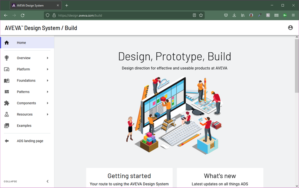
AVEVA Design System
The transition from acquired desktop software to a feature of the AVEVA cloud offering made branding and unified user experience a high priority.

The product suite in AVEVA has mostly come through acquisition. A by-product of this is that each product had made its own design decisions. Moving each product into the cloud and pushing the seamless transition between products only made this difference in visual design and UX even more apparent. Several years ago now, I had pushed for the UX team to create a common design system. Several teams had already aligned on Google Material Design V2 on which the AVEVA Design System is based. This was and remains a large undertaking. In addition to the contribution of all of the UX designers, we have a dedicated team of a front end developer and dedicated tester, which I managed.
Early on I made the decision to split the design system into three areas; UX guidance, visual alignment, use of common components. The idea was that we had over 150+ products of vastly different maturities and future investment. By aligning on UX guidance first, the product would follow similar user flows and pathways and feel like it was part of a larger suite. If development effort was allowed, the next phase would be to align visually. Again, different products had different technology stacks and we shouldn't be dictating how teams should build their products. Finally adopting a set of common components would future proof the application against any evolution in design or change in branding.
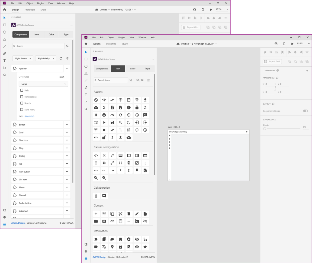
To support the design system documentation, a website was built as well as a plugin for Adobe XD. I decided to democratize the design process somewhat since lots of product managers were designing in PowerPoint anyway. We didn't need to be a bottleneck for the design process for the more straightforward user flows.