The Northwest Vipers are an amateur American football club based in the northwest of Ireland. I've played for them for a few years now. In 2024 they hit their tenth year as a club, changed their name from the Donegal/Derry Vipers to the Northwest Vipers, and decided it was time to tidy up the brand to match.
I offered to pitch some ideas.
Why the rebrand needed to happen
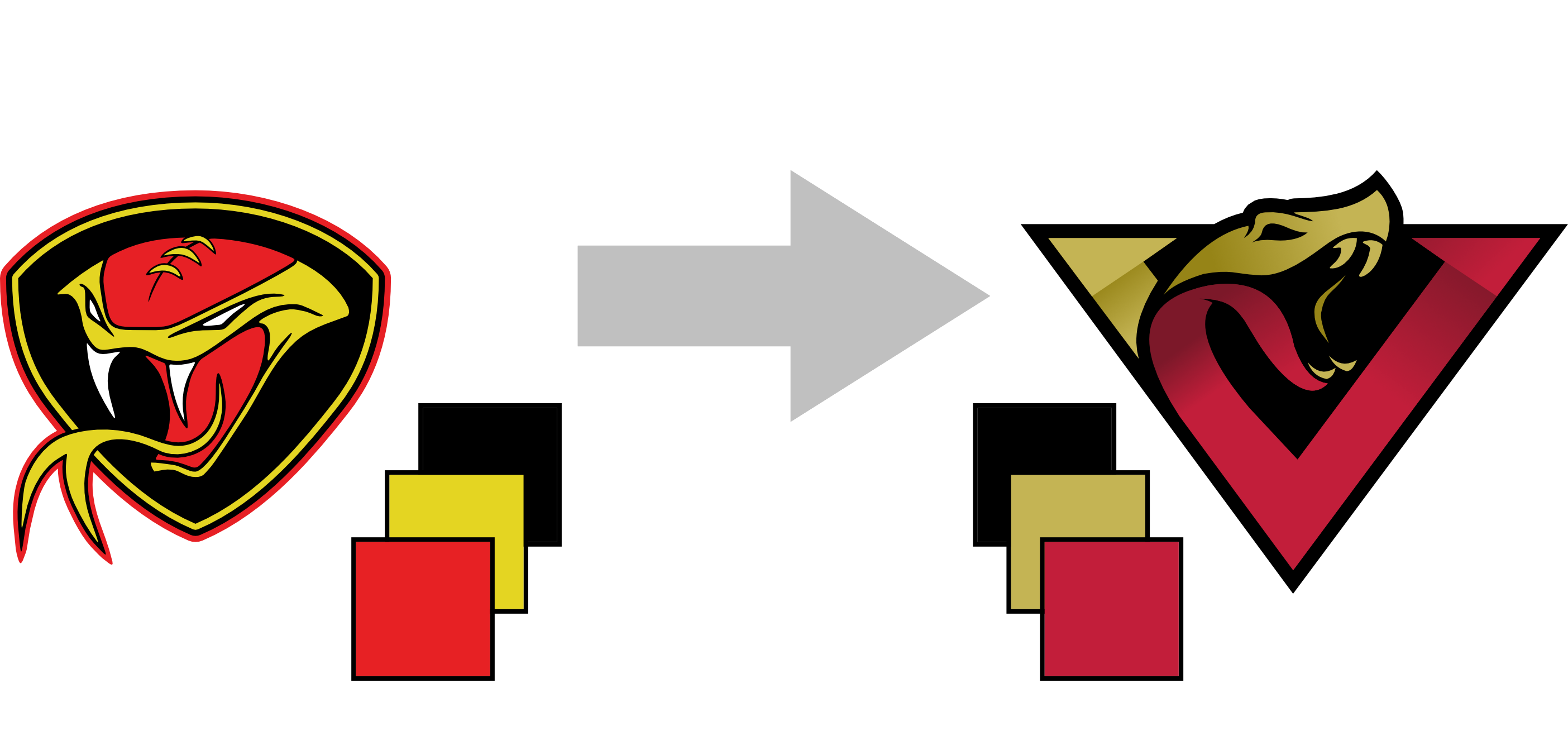
The original logo had done the job, but over ten years of a volunteer organization, brand consistency had slipped. The bigger problem was practical: the original file had been converted from format to format enough times that tracking down a clean copy of it was genuinely difficult. By the time someone needed it for anything official, the quality had degraded. The name change gave everyone a clean reason to start fresh.
The process
I went looking for inspiration in Adobe Stock illustrations and found a couple of snake concepts I thought could work. I pitched two options to the club — mostly as a conversation starter, expecting some back and forth. The conversation ended fairly quickly. One was chosen, and that was that.
I'll admit I was relieved. Rebranding a volunteer club is delicate. Many of the founding members were still involved, and there's always an emotional attachment to these things that can make the process slower and messier than the design work itself. The fact that it moved quickly and without drama was the real win.
The two ideas
The first option was a cleanup of the original: the same shield format and snake illustration, tightened up, redrawn cleanly, bright red and yellow. Safe. Familiar. The kind of thing a club with an emotional attachment to their founding mark might go for.
The second was a completely different direction. A large V letterform — for Vipers, and doing double duty as a downward-pointing triangle — rendered in two overlapping layers of dark gold and deep crimson. The snake head sits at the top of the mark, integrated into the letterform rather than contained inside a badge. The color palette shifted too: away from primary red and yellow, toward something richer and less loud.
The 3D layering effect is in the V itself — the gold and crimson layers sit slightly offset, giving the shape a sense of depth without any gradient or shadow. The same technique Netflix uses on their wordmark: simple, but it makes the difference between a mark that looks flat and one that looks considered.
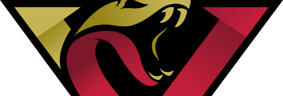
They went with the new one. I wasn't expecting that, honestly. The safer choice was right there.
The new name is cleaner geographically too. Northwest covers Donegal, Derry, and anywhere else in the region without having to negotiate which county gets top billing.
Where it landed
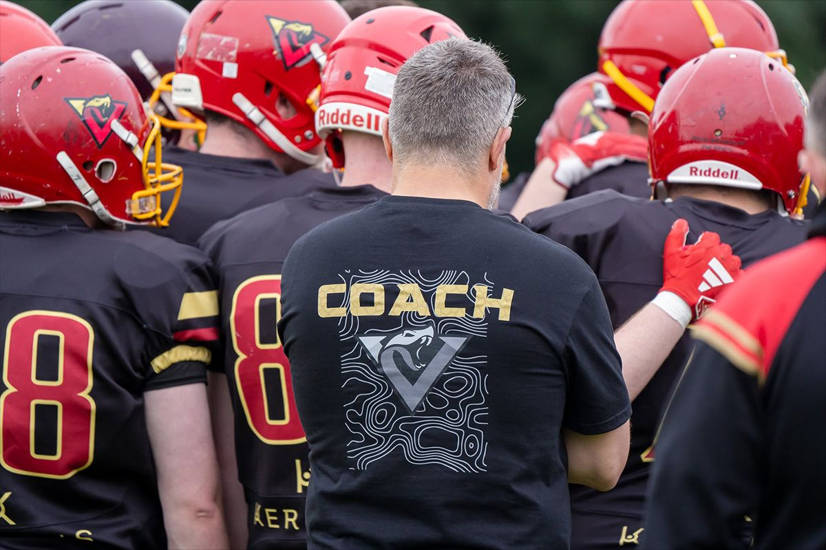
The club is pleased with it, which is what matters. Is it my finest work? Probably not. But it's a solid logo for a club of volunteers that needed something they could actually use consistently, and it came from a file format that won't degrade every time someone exports it. For a rebrand that had to please founding members with a decade of attachment to the old mark, going smoothly was the real brief.
The greyscale holds up too, which isn't nothing.